Hello everyone,
I am Andy, born and raised in Yoshantea.
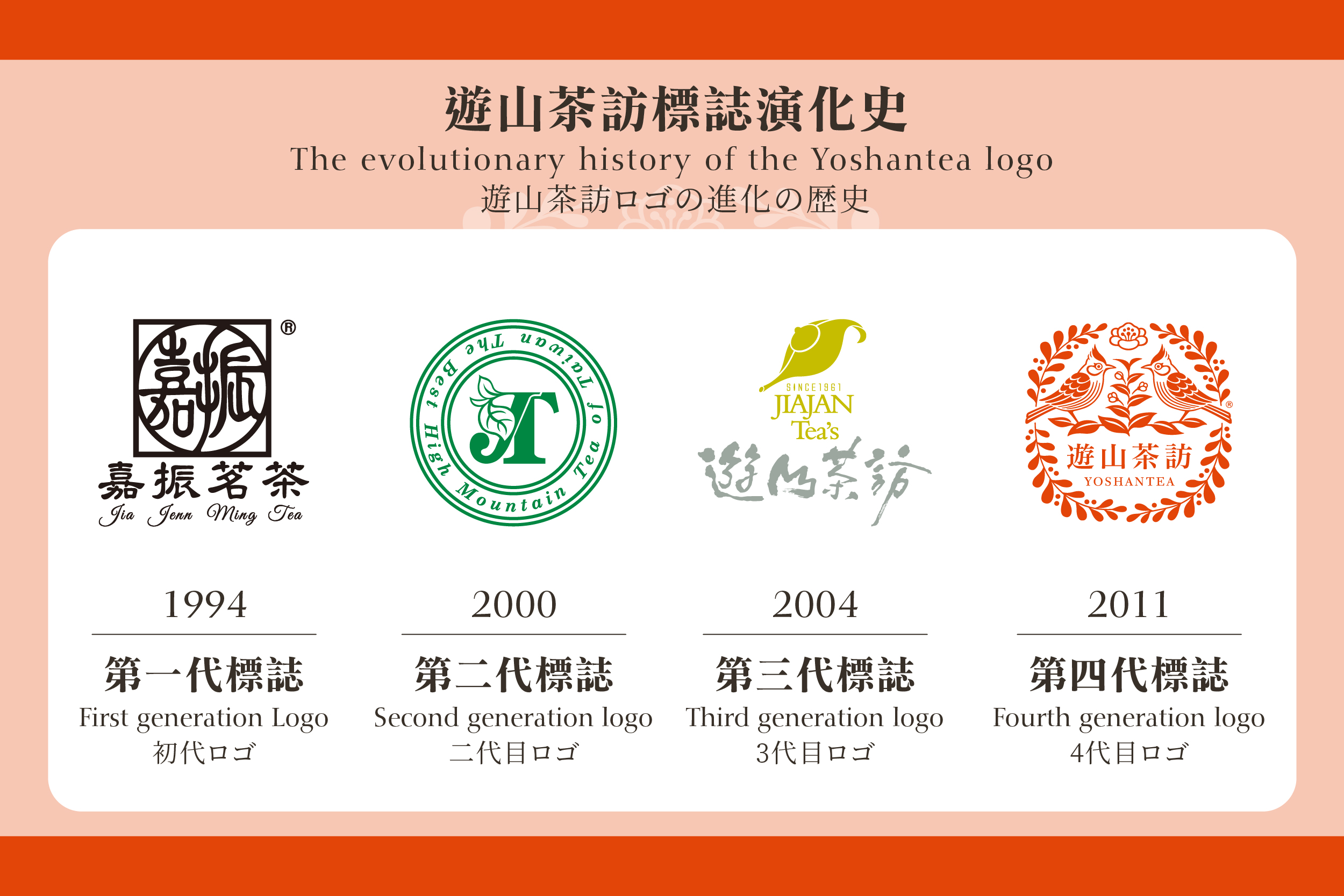
The logo of Yoshantea features a Taiwan Yuhina bird with a persimmon red color. This logo has evolved over time. Back in 1880, when we started growing and making tea, life was quite tough, and there was no logo representing the Chen family.
Chairman "Chung-Chia, Chen" the fifth-generation manager, introduced the concept of a "brand." At that time, the understanding of a "brand" was limited to having a visually appealing logo and packaging. Thus, "Jia Jan Tea Processing Plant | Tea Farmer: Chung-Chia, Chen" the first-generation brand, was born in 1994. "Jia" refers to tea trees, while "Jan" signifies procurement, phonetically similar to the Taiwanese word for " purchasing." The logo is designed in the style of a traditional Chinese seal, featuring the characters for "traditional tea."
However, foreign clients found it challenging to identify this logo. In 2000, a second-generation logo was created by using the English initials "JT" for Jia Jan Tea at the beginning and incorporating a tea leaf symbol. I believe that using all English for the brand logo conveyed a sense of high quality.
The name "Jia Jan Tea" was not easy to remember. Our daily life involves traveling through renowned tea plantations, visiting tea that tastes good. In 2002, a new brand name, "Yoshantea," was born.
"Yo" means travelling, "Shan" means tea mountain.
After proper withering, tea leaves curl at the tip, resembling a teapot's concept. In 2004, a new logo was introduced. The words "Yoshantea" were written in calligraphy, with the character "山" (tea mountain) being particularly artistic in its presentation.
Because the character "山" was not easily recognizable, the most common question we heard was, "What kind of tea is Yoshantea?"
Being unique, localization, and international are questions that Yoshantea's brand continuously contemplates. In 2011, the logo with a Taiwan Yuhina bird with a persimmon red color was born. For the detailed story, please see "
Exploring the Flavors of Tea in the Mountains: The Origin of the Yoshantea Logo" at https://www.yoshantea.com/pc/news.php?id=23102065321d814a693&lang=en.
The brand logo has continuously evolved to meet the demands of the times, especially after changes in the brand name. As time has passed, the brand's profile has become clearer. This is the essence of family business heritage. The more local, the more international.
That's it for today. See you next time.
#Yoshantea #TeaTradition #TeaBranding #BrandEvolution #ChenFamilyHeritage #TeaCultivation #TaiwaneseTea